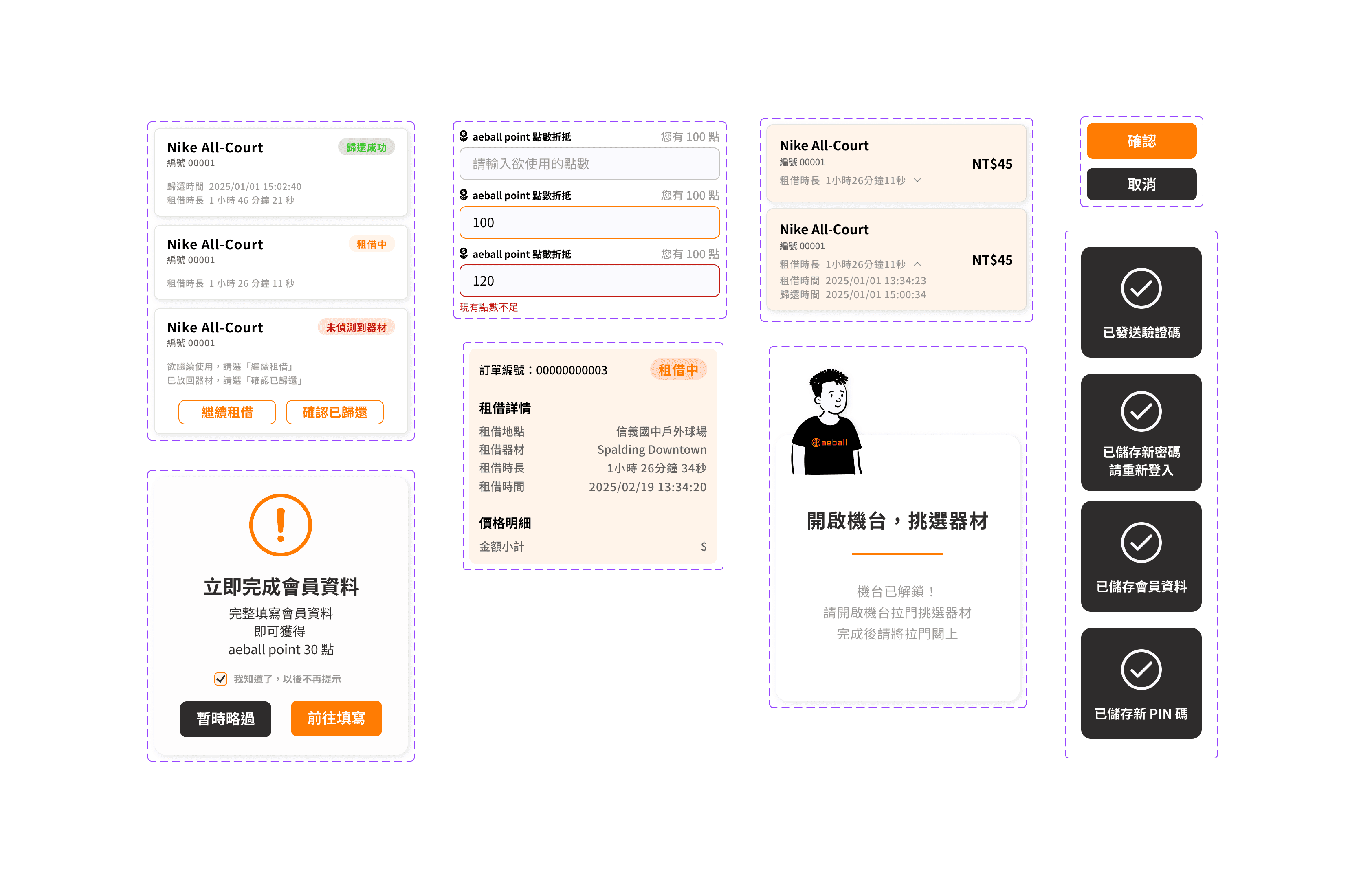
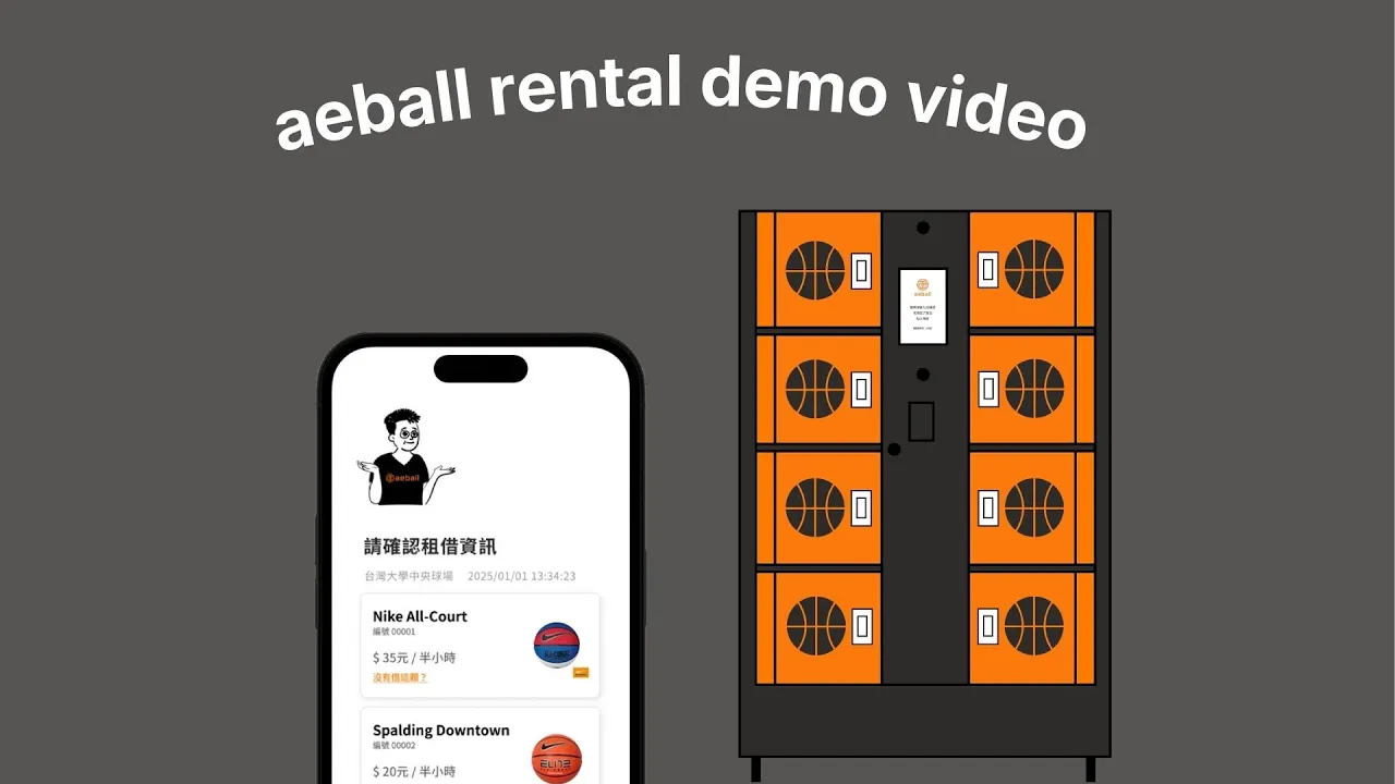
Designed intuitive and clear interfaces for the Aeball Web App, guiding users through the entire ball rental journey - from finding kiosks and borrowing, to returning and payment. The experience spans mobile and physical kiosks: users complete the rental flow on mobile, while picking up and returning balls at on-site kiosks. Therefore, my design focuses on clearly communicating kiosk status to ensure seamless and understandable interactions for users.
The product has been successfully launched and is now live in Taipei. 🎉
My role
UI Designer
Company
Aeball, a self-service ball rental startup 🏀
Deliverable
High-Fidelity Prototype
Duration
Feb. 2025 - Mar. 2025
Aeball is a startup that provides ball rental services through kiosks. In the initial version, users completed the entire rental process directly on the kiosk. However, through observation and gathering feedback, we identified areas for improvement.
😕 Slow Kiosk Touchscreen Response
The kiosk’s touchscreen was unresponsive and slow. Combined with poor screen visibility under sunlight, users struggled to read on-screen text and complete interactions smoothly.
The company aimed to develop multiple kiosk models. By shifting key interactions to users' mobile devices, they could complete the entire rental flow on their phones. This reduced dependency on kiosk touchscreens, increasing hardware flexibility and lowering maintenance costs.
As a result, we decided to develop a web app that enables users to complete the rental process seamlessly on their mobile devices while interacting with the physical kiosk only when necessary.
Our CEO, who also acted as the PM, mapped out the user flow and defined the required information on each screen. I led the visual and interaction design to determine how this information should be presented to users.
Considering the scenario, I set the following design goals:
🫧 Make It Intuitive and Clean
Most users were first-time users of the ball rental service. I aimed to make the rental process and interface easy to understand by adopting a clean layout that allows users to find the information they need intuitively.
Renting and returning balls require interaction with the physical kiosk. I thought clearly communicating the kiosk’s current status was crucial to help users feel confident and understand what is happening at each step.
I wanted users to experience a playful and energetic brand personality through the interface, reinforcing the brand’s lively image and the fun nature of sports.